
Rebrand
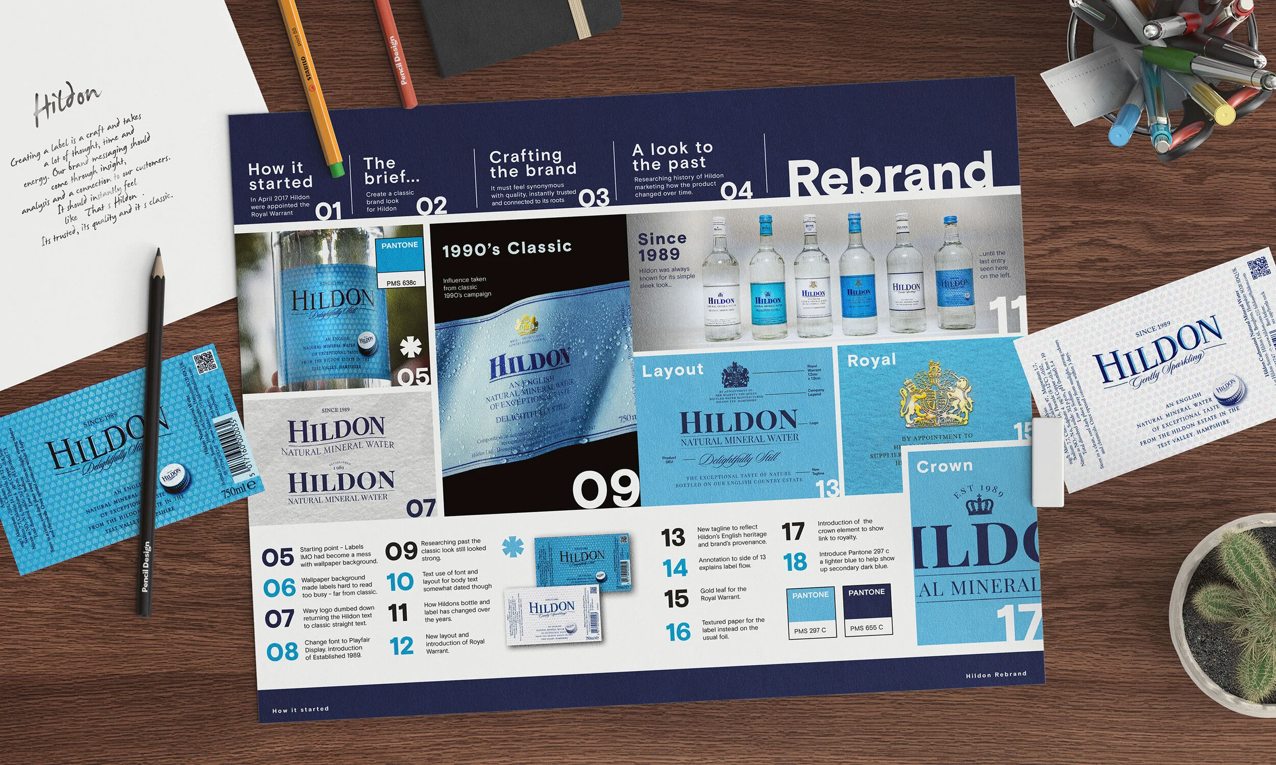
In 2017 Hildon received the Royal Warrant and with it came the opportunity to refresh its identity. Here you can follow the path of the journey I took while redesigning this iconic English brand.

Branding Rationale
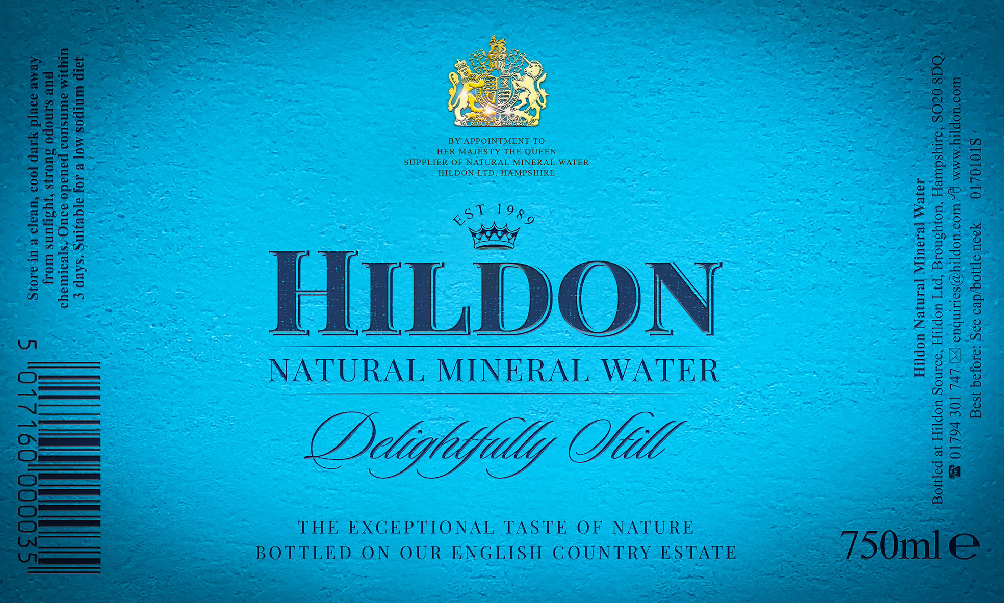
The brief from the board was to return to a more classic look and feel. I felt the branding I inherited had outlived its time and lost its way. So I looked to the rich history of the company for my inspiration.

The 05 image show how far the brand had moved anyway from its sleek origins. The wavy Hildon ident and text on the label was hard to read and looked messy. Far from Hildon’s classic beginnings.

As the process developed two strong concept themes emerged. One based on Hildon's links to it's heritage and the other to royalty and the quality of the water.

I took the ident back to clean straight lines and introduced the crown in reference to Hildon’s royal and quality themes.

Gently Sparkling & Delightfully Still - Concept Final Labels.

My preferred finish for the design can be seen in these concept images. I had wanted to have a textured paper with a gold leaf for the Royal Warrant.

The final labels were eventually printed on pp polypropylene. The material has slight reflective quality that is evident in strong light.

Here you can see the finer details of the finish. The Royal Warrant eventually printed as gold pantone 871

The DAF livery was designed to look like the labels.

In 2020 the branding was tweaked slightly.
You can check out the result in the
product development section.
Below - 750 ml x 12 Bottle -
Box Packaging for major multiples

Gently Sparkling - 750ml x 12 bottle packaging - Front
Illustration - Hildon Estate, wildlife and source tree.

Gently Sparkling - 750ml x 12 bottle packaging - Back

Delightfully Still - 750ml x 12 bottle packaging - Front
Negative space at the sides of the design are trees.
